

[PT]
Movimentar-se à vontade, sem sentir dor.
Essa é a ideia de liberdade que o CIME Saúde Ortopédica oferece aos seus pacientes. Para dar vida a esse projeto nós mergulhamos nessa sensação de liberdade, que além única para cada indivíduo, tem o papel de apresentar o objetivo do centro médico CIME através da sua linguagem e seu atendimento humanizado.
A construção da sua identidade visual é resultado da
multiplicação de três conceitos centrais:
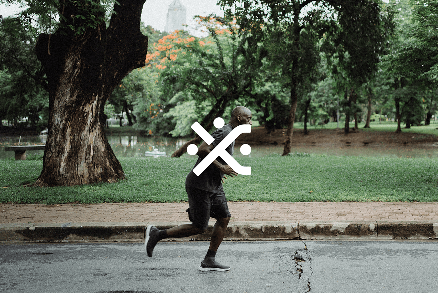
O primeiro evidência o sentimento de troca entre médico e paciente. Uma das propostas do CIME é cuidar das pessoas para que elas possam se moverem com liberdade, isso demanda proximidade entre as duas partes do processo. Para descobrir como poderíamos representar visualmente esse significado, nós emergimos no universo do problema e encontramos nos ligamentos entre os ossos e músculos uma representação gráfica interessante para construção do símbolo.
O segundo conceito exalta o tratamento humanizado: Conceito atrelado ao CIME que chega à raiz do problema, na origem da dor, olhando para cada indivíduo como uma pessoa inteira e não apenas como uma parte do corpo.
Para completar a construção do logotipo, trazemos a sensação de movimento. Somos movimento. Temos um corpo para nos levar para onde quisermos ir, e nos possibilitar fazer o que é necessário para viver bem. É isso que o CIME acredita e que conseguimos representar em sua identidade.
[EN]
Move freely without feeling pain
This is an idea of freedom that CIME Saúde Ortopédica offers its patients. To give life to this project of us unique in this freedom, which also aims at each individual, the role of presenting the objective of the CIME medical center through its language and its humanized care.
The construction of its visual identity is the result of
the multiplication of three central concepts:
The first evidences the feeling of exchange between doctor and patient. One of CIME's proposals is to take care of people so that they can move freely, this demands proximity between the two parts of the process. To discover how we could visually represent this meaning, we emerged in the universe of the problem and found in the ligaments between bones and muscles an interesting graphic representation for the construction of the symbol.
The second concept extols humane treatment: Concept linked to CIME that gets to the root of the problem, at the origin of pain, looking at each individual as a whole person and not just as a part of the body.
To complete the construction of the logo, we bring the feeling of movement. We are movement. We have a body to take us where we want to go, and to enable us to do what is necessary to live well. This is what CIME believes and what we are able to represent in its identity.
To complete the construction of the logo, we bring the feeling of movement. We are movement. We have a body to take us where we want to go, and to enable us to do what is necessary to live well. This is what CIME believes and what we are able to represent in its identity.
To complete the construction of the logo, we bring the feeling of movement. We are movement. We have a body to take us where we want to go, and to enable us to do what is necessary to live well. This is what CIME believes and what we are able to represent in its identity.


[PT]
Cores para personalidade de marca:
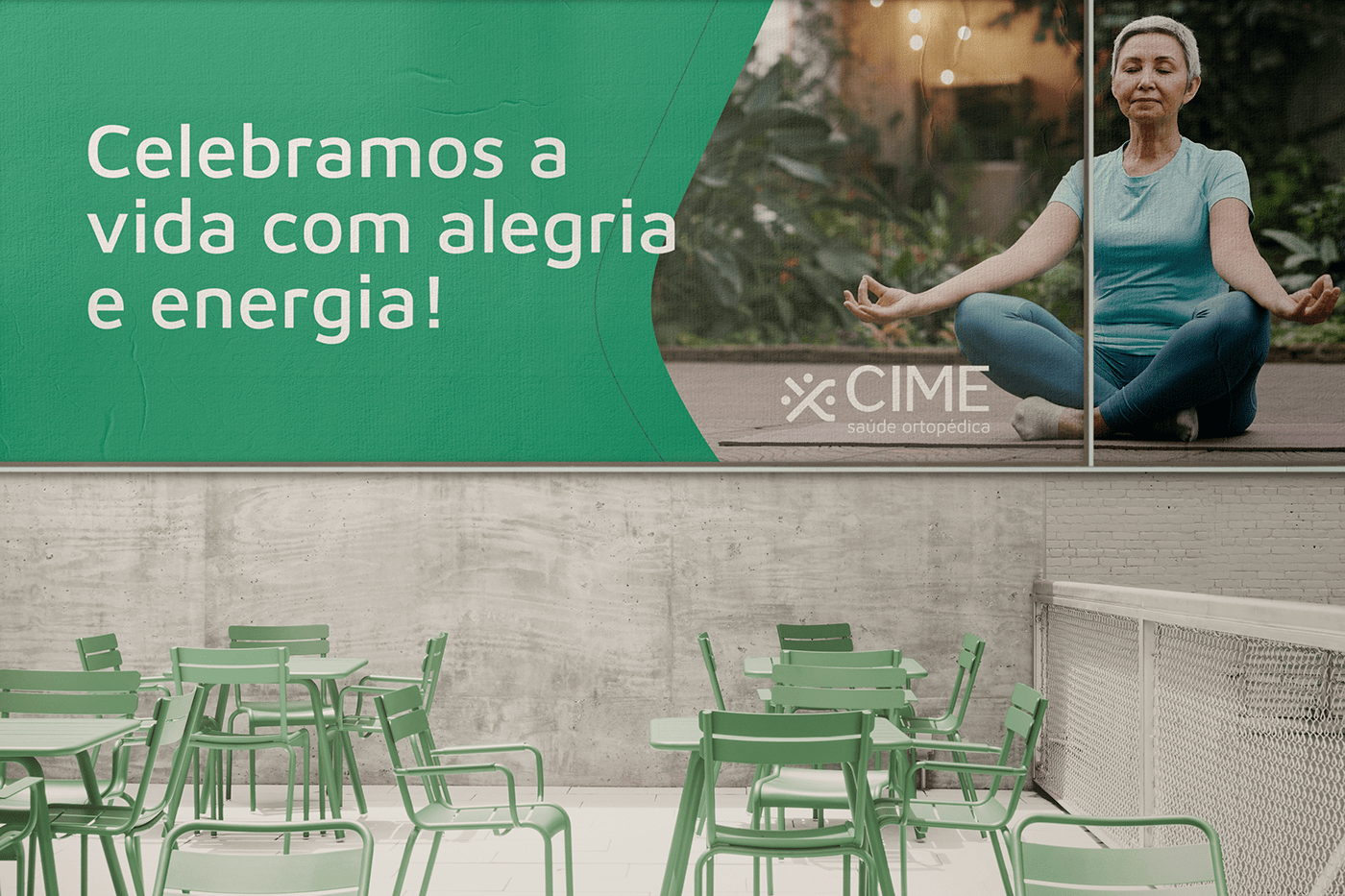
A escolha das cores para o CIME vem com o objetivo de vincular diretamente ao cuidado que eles possuem com os seus pacientes. O objetivo era vincular não somente as cores do símbolos, mas também com o ambiente arquitetônico da clínica. A escolha do verde tem a função de transmitir um ambiente mais tranquilo e aconchegante. A partir disso tomamos dois tons de verde um mais escuro e um mais claro para trazer contraste visual, e um tom de creme para equilibrar. Sempre pensando em se distanciar dos tons frios e "assombrosos" que um ambiente hospitalar transmite.
[EN]
Brand personality colors:
The choice of colors for CIME comes with the aim of directly linking to the care they have with their patients. The objective was to link not only the colors of the symbols, but also the architectural environment of the clinic. The choice of green has the function of transmitting a more peaceful and cozy environment. From that we took two shades of green one darker and one lighter to bring visual contrast, and a shade of cream to balance. Always thinking about moving away from the cold and "haunting" tones that a hospital environment conveys.